One of my side projects, that uses Jetpack compose, needed a side drawer to support filtering functionality for a list view. androidx.compose.material.Scaffold supports adding a Drawer and handling opening and closing it but it doesn’t allow you to customise the drawer behaviour.
For example, I wanted my drawer to open and close from the right hand of the screen, under the topBar and pushing the content to the left when the drawer is open. Here’s a GIF to explain.
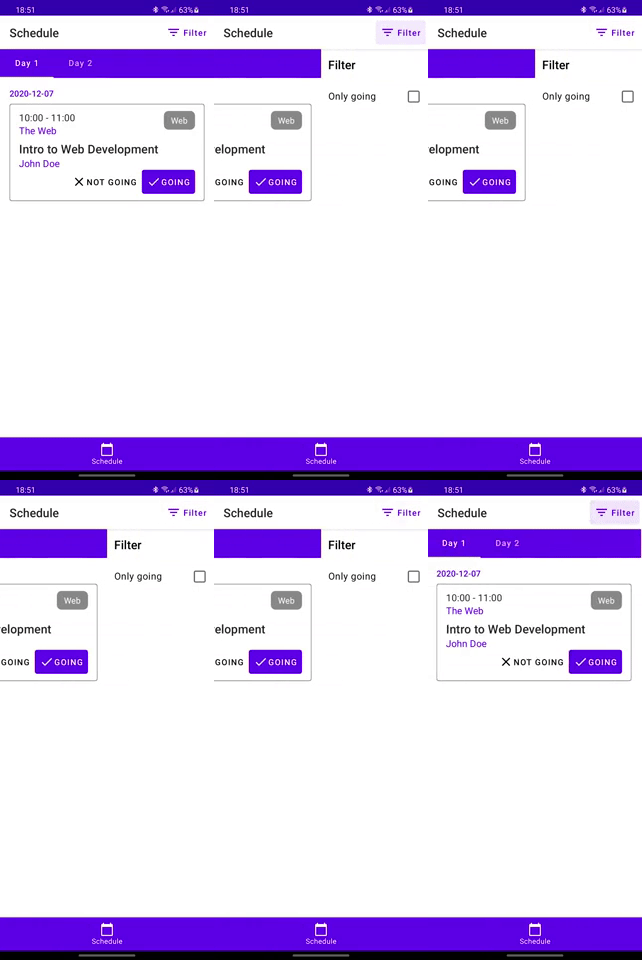
Breaking It Down
Let’s first understand what we are aiming for. We will be breaking down into small steps:
- We need to display the main content and it needs to take the full size of the screen
- We need a side panel that will take roughly half the screen width
- When the side panel is in the closed state, it shouldn’t be seen by the user
- When the side panel is in the open state, it should take half the screen and not overlap with the main content
- Animating opening and closing the side panel
Displaying The Main Content
This part can be easily achieved by using `Scaffold`. Something like this would suffice
@Composable
fun MainContent() {
    return Column {
        // Some content here
    }
}

@Composable
fun ScaffoldWithPanel() {
    Scaffold(
        topBar = { ... },
        bottomBar = { ... },
        bodyContent = {
            MainContent()
        }
    )
}
Adding The Side Panel
For the panel, we can create a composable to return the body of the panel and then we can use Box to wrap both the main content and the side drawer panel.
@Composable
fun SidePanel() {
    return Column {
        // Some content here
    }
}

@Composable
fun MainContent() {
    return Column {
        // Some content here
    }
}

@Composable
fun ScaffoldWithPanel() {
    Scaffold(
        topBar = { ... },
        bottomBar = { ... },
        bodyContent = {
            Box {
                MainContent()
                SidePanel()
            }
        }
    )
}
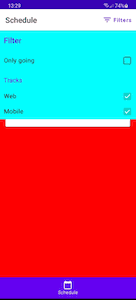
Box is a layout composable that allows us to stack children layouts on top of each other. This means that as it stands, you would end up with something looking like this image:
Hiding The Side Panel When Closed
To be able to hide the panel when it is closed and display it when it’s open, we need to represent its state and store in the ScaffoldWithPanel composable.
We can easily do that either by creating a new enum SidePanelState:
enum class SidePanelState {
    Open, Closed
}
or we can use an existing enum provided by androidx.compose.material package. In this case, we are going to use the one provided to us. It’s called DrawerValue, which is part of DrawerState used by androidx.compose.material.Scaffold. It is defined as follows:
/**
 * Possible values of [DrawerState].
 */
enum class DrawerValue {
    /**
     * The state of the drawer when it is closed.
     */
    Closed,

    /**
     * The state of the drawer when it is open.
     */
    Open
}
We can wrap DrawerValues in a MutableState object and read/write to it from our ScaffoldWithPanel composable.
@Composable
fun ScaffoldWithPanel() {

    val drawerState = remember { mutableStateOf(DrawerValue.Closed) }

    Scaffold(
        topBar = { ... },
        bottomBar = { ... },
        bodyContent = {
            Box {
                MainContent()
                SidePanel()
            }
        }
    )
}
Wrapping the call to SidePanel around if condition would guarantee that the side panel is visible only if the state value is equal to DrawerValue.Open
@Composable
fun ScaffoldWithPanel() {

    val drawerState = remember { mutableStateOf(DrawerValue.Closed) }

    Scaffold(
        topBar = { ... },
        bottomBar = { ... },
        bodyContent = {
            Box {
                MainContent()
                if(drawerState.value != DrawerValue.Open) {
                    SidePanel()
                }
            }
        }
    )
}
In the topBar we can add a button to toggle drawerState. For example, in here we are adding a TextButton:
@Composable
fun ScaffoldWithPanel() {
        val drawerState = ...
        Scaffold(
        topBar = {
            TopAppBar(
                title = ...,
                actions = {
                    TextButton(
                        onClick = {
                            if (drawerState.value == DrawerValue.Closed) {
                                drawerState.value = DrawerValue.Open
                            } else {
                                drawerState.value = DrawerValue.Closed
                            }
                        }
                    ) {
                        Text(
                            text = "Filter"
                        )
                      }
                },
                backgroundColor = ....
            )
        },
        ....
    )
}
Avoiding Overlap Between Main Content and Side Panel
To avoid overlapping the main content and the side panel, we need to size the panel correctly and move the main content out of the way when needed.
The side panel should fill half the width of its parent and to do that we can use WithConstraints which will allow us to get details about the parent size and direction. For now, we are only interested in width:
@Composable
fun ScaffoldWithPanel() {
    Scaffold(
        topBar = { ... },
        bottomBar = { ... },
        bodyContent = {
            WithConstraints {
                val parentWidth = with(AmbientDensity.current) {
                    constraints.maxWidth.toDp()
                }
                val parentHeight = with(AmbientDensity.current) {
                    constraints.maxHeight.toDp()
                }
                Box {
                    MainContent()
                    if(drawerState.value != DrawerValue.Open) {
                        Box(modifier = Modifier.size(parentWidth / 2, height = parentHeight)) {
                            SidePanel()
                        }
                    }
                }
            }
        }
    )
}
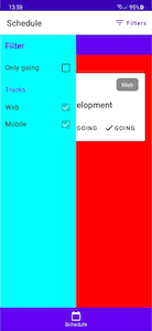
With this logic so far, we should be to show/hide the side panel. When the side panel is visible we are seeing something like this.
We can offset the location of the panel by half of its parent which will cause to fill the right side of the parent instead of the left side:
@Composable
fun ScaffoldWithPanel() {
    Scaffold(
        topBar = { ... },
        bottomBar = { ... },
        bodyContent = {
            WithConstraints {
                val parentWidth = with(AmbientDensity.current) {
                    constraints.maxWidth.toDp()
                }
                val parentHeight = with(AmbientDensity.current) {
                    constraints.maxHeight.toDp()
                }
                Box {
                    MainContent()
                    if(drawerState.value != DrawerValue.Open) {
                        Box(
                            modifier = Modifier
                                .size(parentWidth / 2, height = parentHeight)
                                .offest(x = parentWidth / 2)
                        ) {
                            SidePanel()
                        }
                    }
                }
            }
        }
    )
}
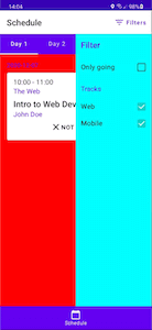
So we end up with the following:
Finally, to avoid the overlap between the side panel and the main content, we can offset the main content in the negative by direction half the parent width. Basically shifting it to the left. That’s only if drawerState says that the side panel is open:
@Composable
fun ScaffoldWithPanel() {
    Scaffold(
        topBar = { ... },
        bottomBar = { ... },
        bodyContent = {
            WithConstraints {
                val parentWidth = with(AmbientDensity.current) {
                    constraints.maxWidth.toDp()
                }
                val parentHeight = with(AmbientDensity.current) {
                    constraints.maxHeight.toDp()
                }
                val mainContentModifier = if (drawerState.value == DrawerValue.Open) {
                    Modifier.offset(x = -parentWidth / 2)
                } else {
                    Modifier
                }
                Box {
                    Box(
                        modifier = mainContentModifier
                    ) {
                        MainContent()
                    }
                    if(drawerState.value != DrawerValue.Open) {
                        Box(
                            modifier = Modifier
                                .size(parentWidth / 2, height = parentHeight)
                                .offest(x = parentWidth / 2)
                        ) {
                            SidePanel()
                        }
                    }
                }
            }
        }
    )
}
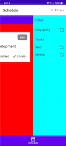
This means that our screen should look as follows:
Animating Opening and Closing Side Panel
The animation we will be looking at is gradually increasing/decreasing the offsets when opening and closing the side panel. This means that the animation is a fire-once animation that doesn’t repeat itself.
So using animate(target = Offset()) should be enough to animate the main content offset changes:
@Composable
fun ScaffoldWithPanel() {
    Scaffold(
        topBar = { ... },
        bottomBar = { ... },
        bodyContent = {
            WithConstraints {
                val parentWidth = with(AmbientDensity.current) {
                    constraints.maxWidth.toDp()
                }
                val parentHeight = with(AmbientDensity.current) {
                    constraints.maxHeight.toDp()
                }
                val mainContentAnimation = animate(
                    target = Offset(
                        x = if (drawerState.value == DrawerValue.Open) {
                            -parentWidth.value / 2
                        } else {
                            0f
                        },
                        y = 0f
                    ),
                )
                Box {
                    Box(
                        modifier = Modifier.offset(
                            x = mainContentAnimation.x.dp,
                            y = mainContentAnimation.y.dp
                        )
                    ) {
                        MainContent()
                    }
                    if(drawerState.value != DrawerValue.Open) {
                        Box(
                            modifier = Modifier
                                .size(parentWidth / 2, height = parentHeight)
                                .offest(x = parentWidth / 2)
                        ) {
                            SidePanel()
                        }
                    }
                }
            }
        }
    )
}
To sum it all up, we used WithConstraints to get the parent width, stacked both the main content and the side panel using Box and animated offset changes with animate to avoid any overlapping them.
